Billboards are one of my biggest graphic design pet peeves, because it seems like no more than 10% of them were actually designed to be useful. There must be some design school somewhere churning out designers who know how to make a billboard eye-catching, but forgets to teach them that a billboard also has to tell you which company it’s for and make it easier for customers to, oh I don’t know, actually buy something from them.
Billboards are almost always on a roadside, so you only have a fraction of a second to make out what it’s trying to tell you, otherwise you will wrap your car around a phone pole. The designer has to work within that fraction of a second to get his or her message across. What is that message?
- Get attention,
- Explain product or service, and
- Branding and contact information.
That’s a lot to say in very little time, so I suppose it’s understandable that so many billboards fail miserably. They seem to have been designed as magazine ads – something that people can look at for as long as they like and that they can hold right up to their face to easily read any amount or size of text.
If you think that sounds like the exact opposite of a billboard, you’re right.
Worth a Thousand Words
Here are two examples, since it’s much easier to show a design than explain it. First up, the typical billboard. Not a “bad” design, but not suited to the medium. Remember, you can only glance at it for a half second or so.
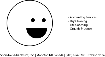
On the surface, it ticks all the boxes. A face looking at the point of interest, clear list of services, contact info, all easily legible. Sounds good, right? Nope, this isn’t a magazine or a web banner. If you only looked at it for a brief moment, what do you remember?
Tiny text
This is the most incomprehensible offense of bad billboard design. Why would you even consider using small text (unless it’s for dramatic effect)? Don’t do it. Make the text as big and legible as possible, then make it 20% bigger than that.
Contact Info Saturation
When seeing your billboard, I barely have enough time for my eyes to send a signal to my brain before I have to look at the road again. I don’t have time to memorize your whole address, including postal code. Yes, that goes for your phone number too. Unless it’s something as memorable as 310-30-30 or 1-800-CALL-ATT, don’t bother.
Too Much Copy
This is pretty self-explanatory. Don’t put 30 seconds’ worth of reading on something that people only have one second to read.
What to Do?
Keep it simple, effective, and memorable. Take this, for example.

That obviously won’t win any design awards, but it illustrates the purpose. It’s big, easy to read, and has the absolute bare minimum of content. “Why yes, my car has trouble! JoesGarage.ca, I’ll check that out when I get home.”
Remove all you can from the billboard, because every additional thing on it makes it less effective. Your goal is just to get people to contact you, not throw your whole press kit at them.